Custom HTML-block
============================================================ -->
/* ── GLOBAL RESET ── */
.fk-lp * { box-sizing: border-box; margin: 0; padding: 0; }
.fk-lp {
font-family: 'DM Sans', sans-serif;
color: #1a1a1a;
width: 100%;
font-size: 16px;
line-height: 1.6;
}
/* ── SHARED ── */
.fk-section-label {
font-size: 12px;
font-weight: 700;
text-transform: uppercase;
letter-spacing: 0.1em;
color: #2d6a4a;
margin-bottom: 8px;
}
.fk-section-heading {
font-family: 'Fraunces', serif;
font-size: 28px;
font-weight: 700;
color: #1a1a1a;
line-height: 1.15;
margin-bottom: 10px;
letter-spacing: -0.01em;
}
.fk-section-sub {
font-size: 15px;
color: #333;
line-height: 1.65;
margin-bottom: 32px;
}
.fk-btn-yellow {
display: inline-flex;
align-items: center;
gap: 10px;
background: #e8a020;
color: #1a1a1a;
border: none;
border-radius: 10px;
padding: 16px 28px;
font-family: 'DM Sans', sans-serif;
font-size: 16px;
font-weight: 700;
cursor: pointer;
text-decoration: none;
transition: background 0.2s, transform 0.1s;
}
.fk-btn-yellow:hover { background: #d4911a; color: #1a1a1a; transform: translateY(-1px); }
.fk-btn-yellow:active { transform: scale(0.98); }
.fk-btn-green {
display: inline-flex;
align-items: center;
gap: 8px;
background: #2d6a4a;
color: #fff;
border: none;
border-radius: 8px;
padding: 13px 22px;
font-family: 'DM Sans', sans-serif;
font-size: 14px;
font-weight: 600;
cursor: pointer;
text-decoration: none;
transition: background 0.2s;
}
.fk-btn-green:hover { background: #1b4d35; color: #fff; }
/* ═══════════════════════════════════════
HERO
═══════════════════════════════════════ */
.fk-hero {
display: grid;
grid-template-columns: 1fr 1fr;
min-height: 460px;
background: #f5f0e8;
}
@media (max-width: 680px) {
.fk-hero { grid-template-columns: 1fr; }
.fk-hero-right { min-height: 280px; order: -1; }
}
.fk-hero-left {
padding: 48px 40px 44px;
display: flex;
flex-direction: column;
justify-content: center;
}
@media (max-width: 680px) { .fk-hero-left { padding: 36px 20px 32px; } }
.fk-hero-stars {
display: flex;
align-items: center;
gap: 8px;
margin-bottom: 20px;
}
.fk-stars { color: #e8a020; font-size: 17px; letter-spacing: 2px; }
.fk-stars-text { font-size: 14px; color: #444; font-weight: 500; }
.fk-hero-left h1 {
font-family: 'Fraunces', serif;
font-size: 32px;
font-weight: 800;
line-height: 1.1;
color: #1a1a1a;
margin-bottom: 18px;
letter-spacing: -0.02em;
}
@media (max-width: 480px) { .fk-hero-left h1 { font-size: 26px; } }
.fk-hero-sub {
font-size: 16px;
line-height: 1.7;
color: #333;
margin-bottom: 28px;
}
.fk-hero-cta-note {
font-size: 13px;
color: #666;
margin-top: 10px;
margin-bottom: 18px;
}
.fk-hero-cta-note b { color: #2d6a4a; font-weight: 600; }
.fk-hero-trust {
display: flex;
align-items: center;
gap: 16px;
flex-wrap: wrap;
}
.fk-hero-trust-item {
display: flex;
align-items: center;
gap: 6px;
font-size: 13px;
color: #333;
font-weight: 500;
}
.fk-trust-check {
width: 18px; height: 18px;
border-radius: 50%;
background: #2d6a4a;
display: flex;
align-items: center;
justify-content: center;
flex-shrink: 0;
}
.fk-hero-right {
overflow: hidden;
min-height: 460px;
position: relative;
}
.fk-hero-right img {
width: 100%; height: 100%;
object-fit: cover;
display: block;
position: absolute;
top: 0; left: 0;
}
.fk-badge-strip {
background: rgba(240,192,64,0.15);
border-top: 1px solid rgba(220,172,40,0.3);
border-bottom: 1px solid rgba(220,172,40,0.3);
padding: 13px 0;
}
.fk-badge-inner {
display: flex;
align-items: center;
justify-content: center;
flex-wrap: wrap;
gap: 4px 0;
}
.fk-badge-item {
display: flex;
align-items: center;
gap: 8px;
padding: 4px 24px;
border-right: 1px solid rgba(180,140,20,0.2);
color: #2a2010;
font-size: 13px;
font-weight: 600;
white-space: nowrap;
}
.fk-badge-item:last-child { border-right: none; }
.fk-badge-icon {
width: 24px; height: 24px;
background: #2d6a4a;
border-radius: 50%;
display: flex;
align-items: center;
justify-content: center;
flex-shrink: 0;
}
/* ═══════════════════════════════════════
SOCIAL PROOF
═══════════════════════════════════════ */
.fk-sp {
background: #ffffff;
padding: 56px 40px;
}
@media (max-width: 680px) { .fk-sp { padding: 44px 20px; } }
.fk-sp-inner { max-width: 820px; margin: 0 auto; }
.fk-sp-cards {
display: grid;
grid-template-columns: repeat(3, 1fr);
gap: 16px;
margin-bottom: 36px;
}
@media (max-width: 600px) { .fk-sp-cards { grid-template-columns: 1fr; } }
.fk-sp-card {
background: #f5f0e8;
border-radius: 14px;
padding: 24px 20px;
}
.fk-sp-stars { color: #e8a020; font-size: 15px; letter-spacing: 1px; margin-bottom: 12px; }
.fk-sp-text {
font-size: 15px;
color: #1a1a1a;
line-height: 1.65;
margin-bottom: 16px;
font-style: italic;
}
.fk-sp-author { display: flex; align-items: center; gap: 10px; }
.fk-sp-avatar {
width: 36px; height: 36px;
border-radius: 50%;
background: #2d6a4a;
display: flex;
align-items: center;
justify-content: center;
font-size: 13px;
font-weight: 700;
color: #fff;
flex-shrink: 0;
}
.fk-sp-author-name { font-size: 14px; font-weight: 600; color: #1a1a1a; }
.fk-sp-author-tag {
display: flex;
align-items: center;
gap: 4px;
font-size: 12px;
color: #2d6a4a;
font-weight: 600;
margin-top: 2px;
}
.fk-sp-check {
width: 13px; height: 13px;
border-radius: 50%;
background: #2d6a4a;
display: inline-flex;
align-items: center;
justify-content: center;
}
.fk-sp-stats {
display: flex;
align-items: center;
justify-content: center;
gap: 32px;
flex-wrap: wrap;
padding-top: 28px;
border-top: 1px solid #ebe7df;
}
.fk-sp-stat { text-align: center; }
.fk-sp-stat-num {
font-family: 'Fraunces', serif;
font-size: 28px;
font-weight: 700;
color: #2d6a4a;
display: block;
}
.fk-sp-stat-label { font-size: 13px; color: #555; margin-top: 3px; font-weight: 500; }
.fk-sp-divider { width: 1px; height: 40px; background: #ebe7df; }
/* ═══════════════════════════════════════
VIDEO REVIEWS
═══════════════════════════════════════ */
.fk-vr {
background: #1a1a1a;
padding: 56px 40px;
}
@media (max-width: 680px) { .fk-vr { padding: 44px 20px; } }
.fk-vr-inner { max-width: 900px; margin: 0 auto; }
.fk-vr-top {
display: flex;
align-items: center;
justify-content: space-between;
margin-bottom: 32px;
flex-wrap: wrap;
gap: 12px;
}
.fk-vr-heading {
font-family: 'Fraunces', serif;
font-size: 26px;
font-weight: 700;
color: #ffffff;
line-height: 1.2;
}
.fk-vr-heading span { color: #e8a020; }
.fk-vr-tp { display: flex; align-items: center; gap: 8px; }
.fk-vr-tp-stars { color: #00b67a; font-size: 14px; }
.fk-vr-tp-text { font-size: 13px; color: #999; }
.fk-vr-grid {
display: grid;
grid-template-columns: repeat(4, 1fr);
gap: 14px;
}
@media (max-width: 720px) { .fk-vr-grid { grid-template-columns: repeat(2, 1fr); gap: 12px; } }
.fk-vr-card {
display: flex;
flex-direction: column;
border-radius: 14px;
overflow: hidden;
background: #242424;
}
.fk-vr-video-wrap {
width: 100%;
aspect-ratio: 9/16;
position: relative;
background: #111;
}
.fk-vr-video-wrap iframe {
position: absolute;
top: 0; left: 0;
width: 100%; height: 100%;
border: none;
display: block;
}
.fk-vr-footer {
padding: 12px;
display: flex;
align-items: center;
justify-content: space-between;
gap: 6px;
}
.fk-vr-author { display: flex; align-items: center; gap: 7px; min-width: 0; flex: 1; }
.fk-vr-av {
width: 30px; height: 30px;
border-radius: 50%;
background: #2d6a4a;
display: flex;
align-items: center;
justify-content: center;
font-size: 11px;
font-weight: 700;
color: #fff;
flex-shrink: 0;
}
.fk-vr-name { font-size: 12px; font-weight: 600; color: #fff; line-height: 1.3; }
.fk-vr-role { font-size: 11px; color: #888; line-height: 1.3; }
.fk-vr-stars-s { color: #e8a020; font-size: 10px; }
.fk-vr-verified {
display: flex;
align-items: center;
gap: 3px;
font-size: 11px;
color: #2d6a4a;
font-weight: 600;
flex-shrink: 0;
}
.fk-vr-vcheck {
width: 13px; height: 13px;
border-radius: 50%;
background: #2d6a4a;
display: flex;
align-items: center;
justify-content: center;
}
/* ═══════════════════════════════════════
MENY
═══════════════════════════════════════ */
.fk-menu {
background: #ffffff;
padding: 56px 40px;
}
@media (max-width: 680px) { .fk-menu { padding: 44px 20px; } }
.fk-menu-inner { max-width: 820px; margin: 0 auto; }
.fk-menu-top {
display: flex;
align-items: flex-start;
justify-content: space-between;
margin-bottom: 36px;
flex-wrap: wrap;
gap: 12px;
}
.fk-menu-link {
font-size: 14px;
color: #2d6a4a;
font-weight: 600;
text-decoration: underline;
white-space: nowrap;
margin-top: 4px;
}
.fk-menu-link:hover { color: #1b4d35; }
.fk-menu-grid {
display: grid;
grid-template-columns: repeat(5, 1fr);
gap: 16px;
}
@media (max-width: 720px) { .fk-menu-grid { grid-template-columns: repeat(3, 1fr); gap: 12px; } }
@media (max-width: 480px) { .fk-menu-grid { grid-template-columns: repeat(2, 1fr); gap: 10px; } }
.fk-menu-card {
display: flex;
flex-direction: column;
align-items: center;
text-align: center;
gap: 10px;
}
.fk-menu-img-wrap {
width: 100%;
aspect-ratio: 1/1;
border-radius: 50%;
overflow: hidden;
background: #f5f0e8;
border: 3px solid #f5f0e8;
transition: border-color 0.2s;
}
.fk-menu-img-wrap:hover { border-color: #2d6a4a; }
.fk-menu-img-wrap img { width: 100%; height: 100%; object-fit: cover; display: block; }
.fk-menu-name { font-size: 14px; font-weight: 600; color: #1a1a1a; line-height: 1.3; }
.fk-menu-sub { font-size: 12px; color: #666; margin-top: -4px; }
/* ═══════════════════════════════════════
HUR DET FUNKAR + GARANTI
═══════════════════════════════════════ */
.fk-how {
background: #f5f0e8;
padding: 56px 40px;
}
@media (max-width: 680px) { .fk-how { padding: 44px 20px; } }
.fk-how-inner { max-width: 740px; margin: 0 auto; }
.fk-how-steps {
display: grid;
grid-template-columns: repeat(3, 1fr);
gap: 16px;
margin-top: 32px;
}
@media (max-width: 600px) { .fk-how-steps { grid-template-columns: 1fr; } }
.fk-how-step {
display: flex;
flex-direction: column;
align-items: center;
text-align: center;
padding: 26px 20px;
background: #ffffff;
border-radius: 14px;
}
.fk-how-icon {
width: 64px; height: 64px;
border-radius: 50%;
background: #e5f3ec;
display: flex;
align-items: center;
justify-content: center;
margin-bottom: 16px;
}
.fk-how-step-num { font-size: 12px; font-weight: 700; color: #2d6a4a; margin-bottom: 6px; text-transform: uppercase; letter-spacing: 0.08em; }
.fk-how-step-title { font-family: 'Fraunces', serif; font-size: 17px; font-weight: 700; color: #1a1a1a; margin-bottom: 8px; line-height: 1.2; }
.fk-how-step-desc { font-size: 14px; color: #333; line-height: 1.65; }
.fk-gar {
margin-top: 20px;
background: #ffffff;
border-radius: 16px;
padding: 32px 36px;
display: grid;
grid-template-columns: auto 1fr;
gap: 36px;
align-items: center;
}
@media (max-width: 600px) { .fk-gar { grid-template-columns: 1fr; text-align: center; padding: 28px 24px; justify-items: center; } .fk-gar svg { margin: 0 auto; } .fk-gar > div { text-align: center; } .fk-btn-green { margin: 0 auto; } }
.fk-gar-title { font-family: 'Fraunces', serif; font-size: 22px; font-weight: 700; color: #1a1a1a; margin-bottom: 12px; line-height: 1.2; }
.fk-gar-text { font-size: 15px; color: #333; line-height: 1.65; margin-bottom: 18px; }
/* ═══════════════════════════════════════
JÄMFÖRELSETABELL
═══════════════════════════════════════ */
.fk-cmp {
background: #ffffff;
padding: 64px 40px;
}
@media (max-width: 680px) { .fk-cmp { padding: 44px 20px; } }
.fk-cmp-inner { max-width: 700px; margin: 0 auto; text-align: center; }
.fk-cmp h2 {
font-family: 'Fraunces', serif;
font-size: 34px;
font-weight: 800;
color: #1a1a1a;
line-height: 1.1;
letter-spacing: -0.02em;
}
@media (max-width: 480px) { .fk-cmp h2 { font-size: 26px; } }
.fk-cmp-sub { font-size: 16px; color: #333; margin: 10px 0 36px; line-height: 1.6; }
.fk-cmp-table { width: 100%; border-collapse: separate; border-spacing: 0; text-align: left; margin-bottom: 36px; }
.fk-cmp-thead th { padding: 16px 20px; font-size: 15px; font-weight: 700; }
.fk-cmp-thead th:first-child { background: transparent; width: 36%; }
.fk-cmp-thead .th-fk { background: #2d6a4a; color: #fff; border-radius: 12px 12px 0 0; text-align: center; width: 32%; }
.fk-cmp-thead .th-self { background: #2e2e2e; color: #fff; border-radius: 12px 12px 0 0; text-align: center; width: 32%; }
.fk-cmp-row td { padding: 16px 20px; font-size: 15px; vertical-align: middle; border-bottom: 1px solid #e8e4dc; color: #1a1a1a; }
.fk-cmp-row:last-child td { border-bottom: none; }
.fk-cmp-row .td-feat { font-weight: 600; background: transparent; }
.fk-cmp-row .td-fk { background: rgba(45,106,74,0.06); text-align: center; }
.fk-cmp-row .td-self { background: rgba(46,46,46,0.04); text-align: center; }
.fk-cmp-row:last-child .td-fk { border-radius: 0 0 0 12px; }
.fk-cmp-row:last-child .td-self { border-radius: 0 0 12px 0; }
.fk-pill-yes { display: inline-flex; align-items: center; gap: 7px; background: #e5f3ec; color: #1a3a2e; border-radius: 24px; padding: 6px 14px; font-size: 14px; font-weight: 600; }
.fk-pill-no { display: inline-flex; align-items: center; gap: 7px; background: #ebebeb; color: #555; border-radius: 24px; padding: 6px 14px; font-size: 14px; font-weight: 500; }
.fk-icon-yes { width: 18px; height: 18px; border-radius: 50%; background: #2d6a4a; display: inline-flex; align-items: center; justify-content: center; flex-shrink: 0; }
.fk-icon-no { width: 18px; height: 18px; border-radius: 50%; background: #bbb; display: inline-flex; align-items: center; justify-content: center; flex-shrink: 0; }
.fk-cmp-cta { display: block; width: 100%; max-width: 480px; margin: 0 auto; background: #e8a020; color: #1a1a1a; border: none; border-radius: 50px; padding: 18px 32px; font-family: 'DM Sans', sans-serif; font-size: 16px; font-weight: 700; text-align: center; cursor: pointer; text-decoration: none; transition: background 0.2s; }
.fk-cmp-cta:hover { background: #d4911a; }
@media (max-width: 500px) {
.fk-cmp-table, .fk-cmp-table thead, .fk-cmp-table tbody, .fk-cmp-table tr, .fk-cmp-table td, .fk-cmp-table th { display: block; width: 100%; }
.fk-cmp-thead { display: none; }
.fk-cmp-row { margin-bottom: 16px; border-radius: 12px; overflow: hidden; border: 1px solid #ebe7df; }
.fk-cmp-row td { border-bottom: 1px solid #ebe7df; padding: 12px 16px; font-size: 14px; }
.fk-cmp-row td:last-child { border-bottom: none; }
.fk-cmp-row .td-feat { font-weight: 700; color: #1a1a1a; background: #f5f0e8; font-size: 14px; }
.fk-cmp-row .td-fk { background: #f0f8f4; text-align: left; }
.fk-cmp-row .td-self { background: #f9f9f9; text-align: left; }
.fk-cmp-row .td-fk::before { content: "✓ Fitnesskocken"; font-weight: 700; font-size: 11px; color: #2d6a4a; text-transform: uppercase; letter-spacing: 0.06em; display: block; margin-bottom: 6px; }
.fk-cmp-row .td-self::before { content: "✕ Laga själv"; font-weight: 700; font-size: 11px; color: #888; text-transform: uppercase; letter-spacing: 0.06em; display: block; margin-bottom: 6px; }
.fk-cmp-row:last-child .td-fk, .fk-cmp-row:last-child .td-self { border-radius: 0; }
.fk-pill-yes, .fk-pill-no { font-size: 14px; padding: 5px 12px; }
}
/* ═══════════════════════════════════════
VALUE PROPS
═══════════════════════════════════════ */
.fk-vp {
background: #f5f0e8;
padding: 56px 40px;
}
@media (max-width: 680px) { .fk-vp { padding: 44px 20px; } }
.fk-vp-inner { max-width: 740px; margin: 0 auto; }
.fk-vp-grid {
display: grid;
grid-template-columns: repeat(3, 1fr);
gap: 12px;
margin-top: 32px;
}
@media (max-width: 640px) { .fk-vp-grid { grid-template-columns: 1fr 1fr; gap: 10px; } }
@media (max-width: 360px) { .fk-vp-grid { grid-template-columns: 1fr; } }
.fk-vp-card { background: #ffffff; border: 1px solid #ebe7df; border-radius: 14px; padding: 20px 16px; }
.fk-vp-icon { width: 40px; height: 40px; background: #e5f3ec; border-radius: 10px; display: flex; align-items: center; justify-content: center; margin-bottom: 12px; }
.fk-vp-title { font-size: 15px; font-weight: 700; color: #1a1a1a; margin-bottom: 6px; line-height: 1.3; }
.fk-vp-desc { font-size: 13px; color: #444; line-height: 1.55; }
.fk-vp-card-wide { background: #ffffff; border: 1px solid #ebe7df; border-radius: 14px; padding: 20px 16px; grid-column: span 3; }
@media (max-width: 640px) { .fk-vp-card-wide { grid-column: span 2; } }
@media (max-width: 360px) { .fk-vp-card-wide { grid-column: span 1; } }
.fk-vp-wide-inner { display: flex; align-items: flex-start; gap: 14px; }
.fk-vp-link { display: inline-flex; align-items: center; gap: 5px; font-size: 13px; color: #2d6a4a; font-weight: 600; text-decoration: none; margin-top: 8px; }
.fk-vp-link:hover { color: #1b4d35; }
.fk-vp-cta-wrap { margin-top: 32px; text-align: center; }
.fk-vp-cta-note { font-size: 13px; color: #555; margin-top: 10px; }
.fk-vp-cta-note b { color: #2d6a4a; font-weight: 600; }
@media (max-width: 480px) { .fk-btn-yellow { width: 100%; justify-content: center; } }
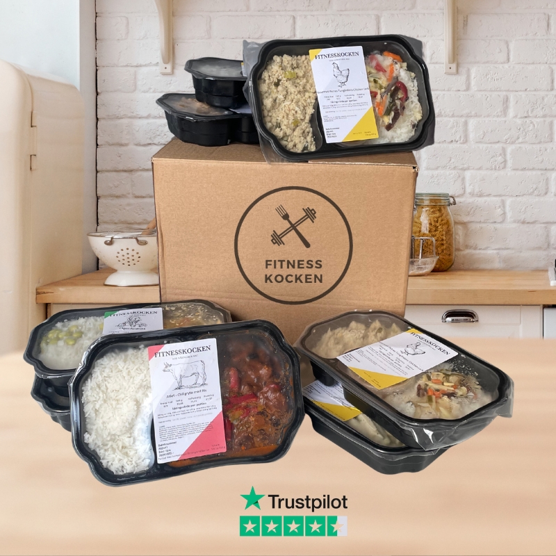
★★★★★
4,6/5 baserat på 94 riktiga omdömen
Slipp stressa över vad du ska äta — Få hem mat varje vecka
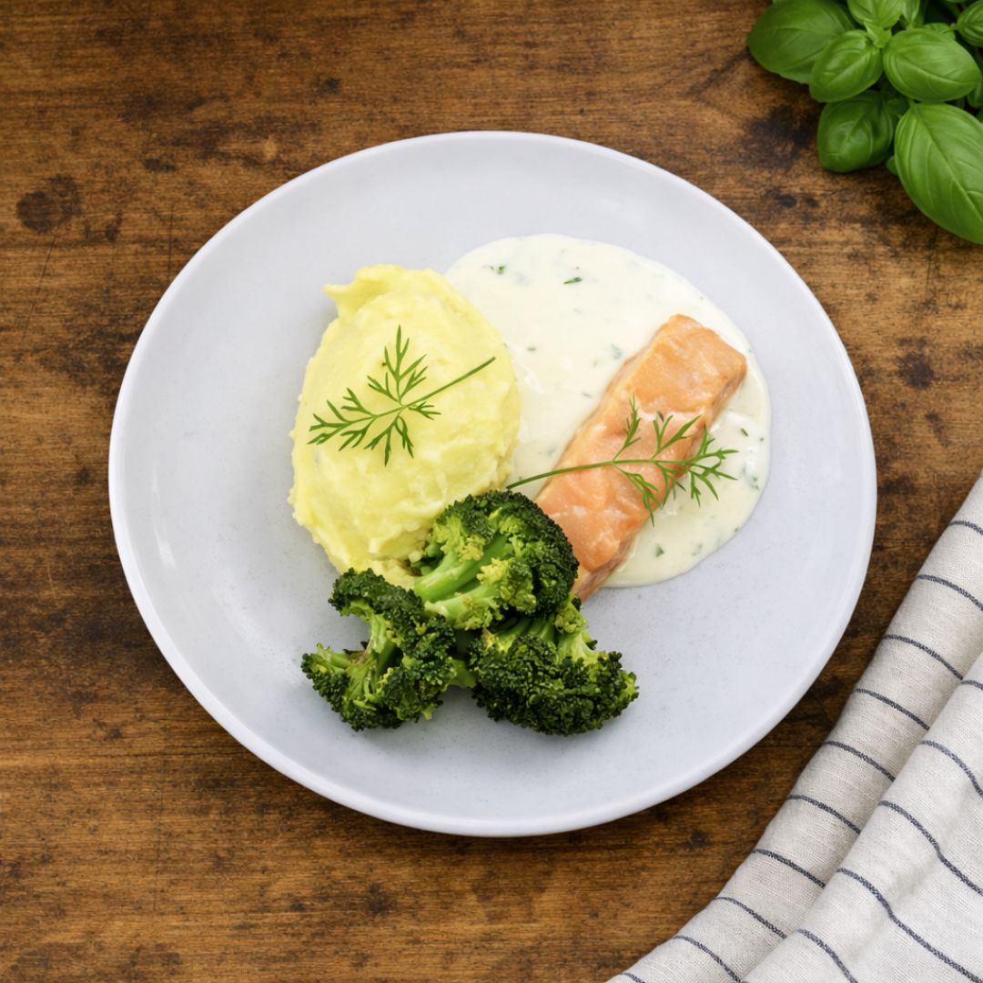
De flesta har varken tid eller ork att alltid laga bra mat varje dag. När du får hem Protein+ får du hem färdiga matlådor hem till din dörr varje vecka. Näringsberäknade och klara med 50g protein per portion.
Starta din prenumeration
Använd kod WELCOME20 och spara 20% på din första order
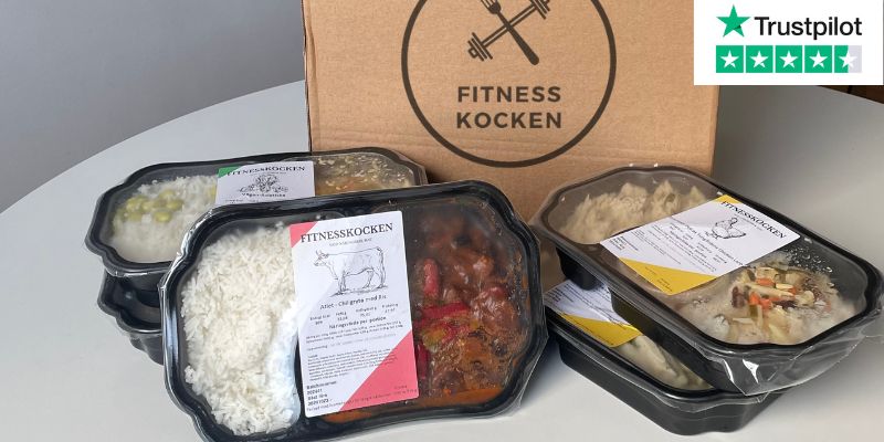
Bli en av våra 2 000+ nöjda kunder
Varför Protein+
Byggt för dig som tränar på riktigt
Allt vi gör är designat för att passa en aktiv vardag.
50g protein per måltid
Träffar dina mål utan att räkna ett gram själv
Näringsberäknat och klart
Full koll på makros utan appar eller gissning
Sparar 4-6 timmar i veckan
Ingen shopping, planering eller disk
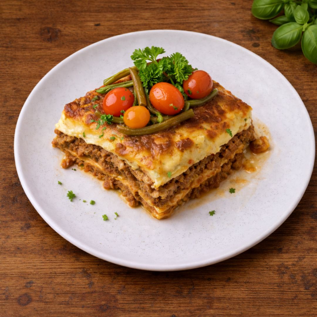
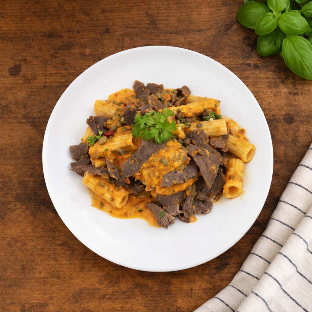
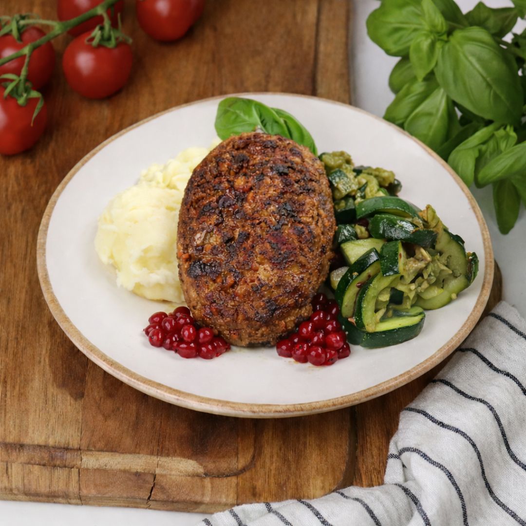
Ny meny varje vecka
5 nya rätter varje vecka, aldrig tråkigt
Ingen bindningstid
Starta, pausa eller avsluta när du vill
Kyld hemleverans
Spår leveransen i realtid via SMS
Vi levererar till 80% av alla städer
Vi når merparten av alla städer. Du kan kolla om vi levererar hem till dig genom att klicka nedan.
Kolla din ort →
Så otroligt smidigt
★★★★★
Aldrig tidigare har jag kunnat äta nyttigt, få det enkelt och faktiskt bli mätt. Protein+ är en sänd från ovan för oss som rör på oss regelbundet.
★★★★★
Jag sparar tid och missar aldrig att få i mig näringsrika måltider. Det gör det mycket lättare att nå sina mål.
★★★★★
Har testat alla alternativ och Fitnesskocken är bäst. God, nyttig mat i ordentliga portioner och service i toppklass.
250 000+matlådor levererade
sedan 2019levererar vi varje vecka
Samma resultat.
Utan halva veckan i köket.
Laga mat själv eller låta oss göra det? Här är den ärliga jämförelsen.
|
Fitnesskocken |
Laga själv |
| Tid i köket per gång | 3 minuter | 30-90 minuter |
| Protein per måltid | 50g, alltid | Osäkert |
| Matplanering | Ingår automatiskt | Tar tid och energi |
| Variation i menyn | 5 nya rätter/vecka | Det vanliga |
| Fungerar en stressig vecka | Alltid | Sällan |
Starta din prenumeration idag →
Enkelt och smidigt
Tre steg till rätt mat varje vecka
Från beställning till maten på bordet. Enklare än du tror.
Steg 1
Välj antal matlådor
Välj antal matlådor per leveranstillfälle och frekvens. Anpassa efter dina behov.
Steg 2
Välj leveransdag
När du checkar ut väljer du leveransdag och betalsätt. Enkelt och tryggt med Klarna eller kort.
Steg 3
Kyld hemleverans på väg
Vi tillagar maten och skickar hem den till dig nästkommande vecka. Du spårar leveransen i realtid via SMS.
100%
NÖJDHETS
GARANTI
100% nöjdhetsgaranti
Vi står alltid för vad vi levererar
Vi är övertygade om att du kommer älska maten. Men om något inte lever upp till förväntningarna ersätter vi dig med nya matlådor, inga krångliga frågor.
Prova riskfritt →